Now I've learned quite a lot of interesting things since then, including a technique called kernel density estimation, a simple method to estimate the frequency/density of x,y coordinates. I wanted to take a look at Rivera's cutters again, this time in the form of pretty plots.
I've used hexagonal binning methods before to show Rivera's pitch movement plots, as well as filled contour loess regression plots for other players. Here's some plots of Rivera's cutters against RHH and LHH using bivariate kernel density estimation, a catalog of various colorful schemes:
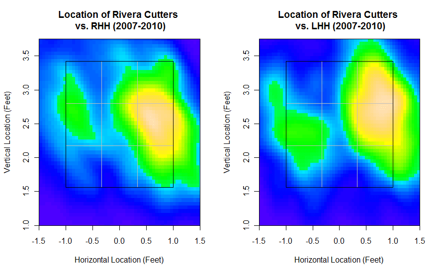
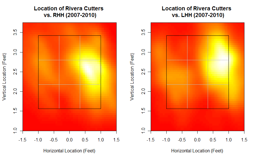
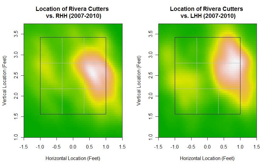
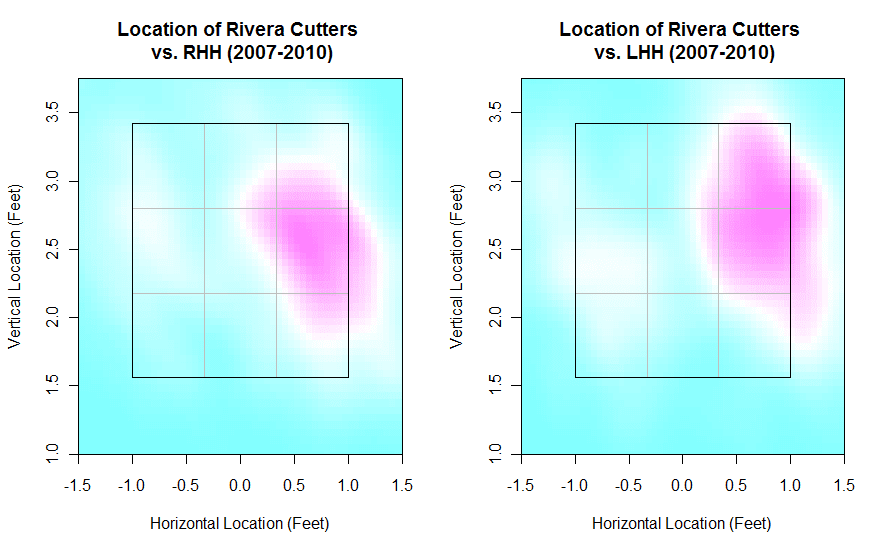
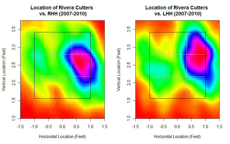
I've already talked extensively about how Rivera locates his cutters, but it's pretty clear that Rivera still has pinpoint control. Those are just a few of the possible color schemes I can use to display these density plots. The rainbow one in the last plot shows more levels of where Rivera locates his cutter. The second plot uses heat colors while the third plot uses terrain colors. Mind you, these are all plots of the same data, just different color schemes. I'll definitely make use of these density plots in the future (I've made them before for basketball shot locations) in order to show pitch locations and such. I'll probably keep the color schemes consistent though (I think the first plot is the best combination of contrast and color), but for now, these are definitely pretty to look at.
1 comments:
I've been using White-to-Red for my charts recently (as in my knuckleball articles like: http://assets.sbnation.com/assets/424982/DickeyLocations.png). It's just easier to tell that darker of a color means more frequent for me.
On the other hand, http://3.bp.blogspot.com/_jpHBaQhAbHI/THSIaxRpbKI/AAAAAAAAAGk/Tc0Ag5HnjS0/s1600/Jet.png, doesn't look too bad.
I'd avoid pastels personally though, and would go with a strong color (such as Red) as your hot zones, personally.
Post a Comment