Think Blue Crew
"Someone created the box score—and he should be shot." -- Daryl Morey (McCormick '96)
Monday, September 20, 2010
Rivera's Cutters @ FanGraphs
Saturday, September 4, 2010
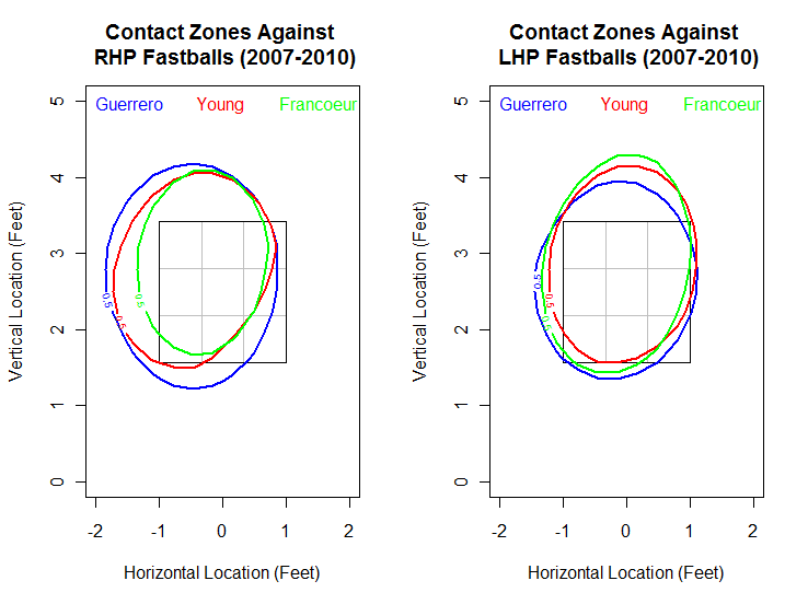
Comparing Swing-Happy Contact Zones
Against fastballs, swing zones vs. contact zones:
Friday, September 3, 2010
Comparing Swing-Happy Swing Zones
Let's take a look at the 50% swing zones of each of these hitters by pitch type. First up, fastballs:
Tuesday, August 31, 2010
Matt Kemp's Struggles: Fastballs and Breaking Balls
A very short Cliff Notes version. Basically, Matt Kemp has been struggling this season, and even if you account for the low BABIP, he is still striking out at a higher rate this season compared to last. What also confounded me that even though he has a higher strikeout rate, he is also setting a career high in walk rate as well. Usually, drawing walks and getting struck out are thought of as tradeoffs, opposite ends of the "patience scale." Kensai also had a meticulous look at the changes in Kemp's swinging mechanics, and he did find a change that hopefully the Dodgers are aware of.
I would like to extend on Kensai's post using PITCHf/x. There are two areas I'd like to investigate: 1) Is Kemp swinging at more strikes in 2010 compared to 2009 and how? and 2) Is Kemp making less contact in 2010 compared to 2009 and how?
To answer these two questions, I'd like to look at Kemp against all fastballs (four-seamers, two-seamers, cutters, and splitters) and against all breaking balls (curveballs, sliders, and changeups). Let's get started with a table of Matt Kemp's plate discipline and swing outcome rates in 2009 vs. that of 2010, broken down between fastballs and breaking balls and by pitcher's handedness:
Monday, August 30, 2010
Rivera's Cutters Working the Count
We know that Rivera has pinpoint control and likes to work the outer and inner edges of the strikezone against both right-handed batters and left-handed batters. We also know that Rivera is great at working the count, rarely getting to 3 balls in a count. Combining both of these ideas, can we figure out how Rivera works the count based on the locations of his cutters?
To do this, let's first look at Rivera's cutters by each count since 2007:
Sunday, August 29, 2010
Cliff Lee's Four-Seamer, Curveball, Cutter, and Changeup
Which brings me to this post about Cliff Lee. Various sources (I looked at several articles, Fangraphs, and yes, Wikipedia) tell me that Lee throws five different pitches, armed with a four-seam fastball, a two-seam fastball, a cutter, a changeup, and a curveball. Plenty of past articles have detailed the faultiness and/or suggested better reclassification techniques of MLBAM's pitch type classification where all of the great PITCHf/x data comes from. I would preface this and my future posts with the knowledge that I will use MLBAM's pitch classification for now, as developing my own algorithm to determine a better classification seems like a time-consuming and daunting task to say the least.
But before I dive into plots of Cliff Lee's pitches, I need to look at his pitch types first according to MLBAM. Here's a list of the frequency of his pitches by handedness since 2007, according to MLBAM's classification and my database:
Saturday, August 28, 2010
Density Plots of Rivera's Cutters
Now I've learned quite a lot of interesting things since then, including a technique called kernel density estimation, a simple method to estimate the frequency/density of x,y coordinates. I wanted to take a look at Rivera's cutters again, this time in the form of pretty plots.
I've used hexagonal binning methods before to show Rivera's pitch movement plots, as well as filled contour loess regression plots for other players. Here's some plots of Rivera's cutters against RHH and LHH using bivariate kernel density estimation, a catalog of various colorful schemes:
Friday, August 27, 2010
The Best and Worst Fastball Hitters
If you look at the leaderboard for the past three seasons combined, Albert Pujols, Kevin Youkilis, and Mark Teixeira come out on top as the best fastball hitters in the MLB. In the past three years, Pujols gained 121.6 runs above average against the fastball, while Youkilis and Teixeira gained 99.8 and 94.1 runs above average respectively.
A look at heat maps of run value against the fastball would give the best look at how these hitters fared against the heat. However, I wanted to create plots showing a measure that most readers will understand intuitively. Let's take a look at Pujols, Youkilis, and Teixeira in contact percentage against fastballs (percentage of fastballs they swung and made contact off of):
Thursday, August 26, 2010
Is the Strike Zone Bigger in August?
I wanted to see this for myself using my own method, so I created a called strike probability model for April 2008 vs. August 2008, April 2009 vs. August 2009, and April 2010 vs. August 2010. What I did was I pulled all called strikes and balls (ignoring all the times when the batter swings) within half a foot from the rule book strikezone, half a foot inside and half a foot outside. I then modeled a surface fit for all called strikes over pitches where the batter didn't swing. I assumed that the middle of the inner 0.5 foot border returned called strikes 100% of the time if the model did not project that far inward, and same with balls way outside the strikezone.
Let's take a look at called strikes in April 2008 vs. August 2008 to see if umpires called more strikes as the season went on in the past, where red indicates called strikes and blue indicates balls (blue balls, snicker). Note that I split the strikezone into nine equal-sized boxes for reference, while the outer border is the approximate rule book strikezone:
Wednesday, August 25, 2010
Ryan Howard's Whiffs by Pitch Type
Ryan Howard has been either second or third in the entire MLB in swinging strike percentage and other strikeout categories since Mark Reynolds' debut in 2007. Fangraphs' stats tell us that Howard has swung and missed on 14.6% of pitches so far in 2010 while posting a swinging strike percentage consistently above 15% in the previous three seasons. Like Reynolds, Howard doesn't actually swing at everything compared to other swing-happy batters, swinging at less than 50% of pitches every season for his career.
Again, I'm going to leave out cutters and just look at four-seam fastballs, sliders, curveballs, and changeups due to sample size. Let's look at four-seam fastballs (987 pitches from RHP, 649 pitches from LHP):
Subscribe to: Posts (Atom)